 |
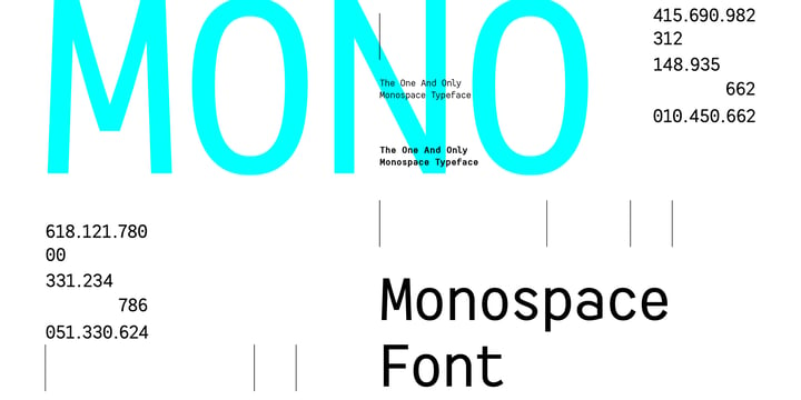
HF Monorita is the first monospace we have created. It is perfect for coding, display and design. The subtle curves on the diagonal strokes create a friendly vibe and can create a better reading flow for the users.
 |
HF Monorita is the first monospace we have created. It is perfect for coding, display and design. The subtle curves on the diagonal strokes create a friendly vibe and can create a better reading flow for the users.
 |
No matter if you’re professional or beginner, your work should be fun. And if you are a coder/programmer, your coding font should be something you enjoy looking for very long time. Square and crisp coding fonts might be easy on the pixels, but are they easy on your eyes? Do they keep you entertained at work?
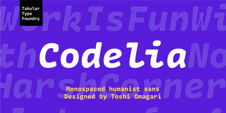
Codelia is a monospaced humanistic typeface designed for coding with focus on comfort and fun without sacrificing legibility or coding functionality. It’s fun but not a joke. Its round shapes are easier on the eyes and make the code look less intimidating. It is not designed to make maximum use of every pixel on screen, but to make you forget about pixels. The italic is full of personality but sober enough to not draw unnecessary attention.
Codelia works great for coding, but also in presentation, education as well as packaging and branding.
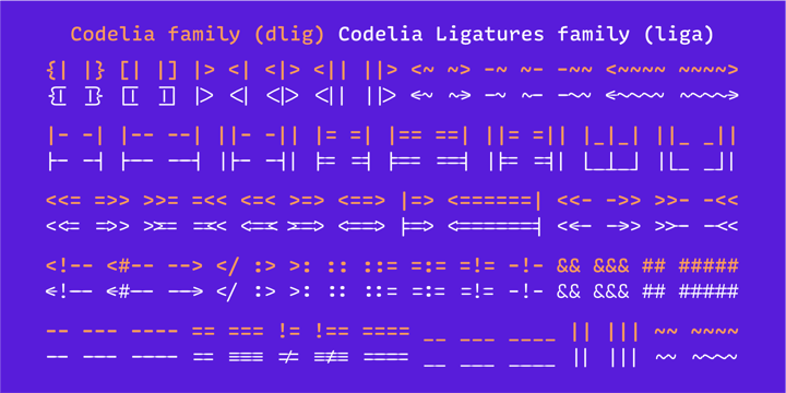
Codelia is available in two families, one with coding ligatures and one without; ligatures in the latter are still present in Diescretionary Ligatures feature (dlig).
 |
| Download Codelia Fonts Family From Tabular Type Foundry |
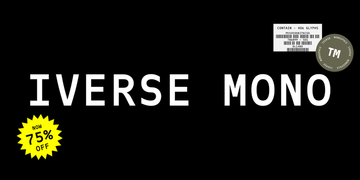 |
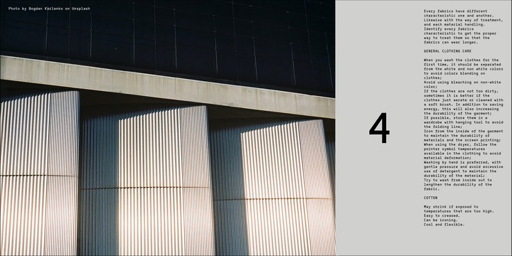
Iverse is a monospace font that come with 2 (two) different type of styles, Regular and Bold. The sans serif based structure is clean and versatile and perfect for body copy and display.
Suitable for codings, captions, description details, layouts, and posters.
 |
| Download Iverse Mono Fonts Family From Minor Praxis |
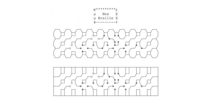 |
This monospace font is to display braille in an original although in a rather "steganographic" way.
Its glyphs are designed from a flat hexagon which can be read as 3 rows of 2 vertices (i.e. regular braille glyph grid). The initial design is illustrated by glyph 'ç' (no dot) and 'û' (6 dots) as illustrated by poster 5.
HexBraille glyphs are connected to each other, so there are 6 connections for each (2 on left/right and 4 on top/bottom). A text using this font will display a lattice, not the honeycomb but instead it will show various patterns and the whole looks similar to a PCB.
In the interline squares are frequent and diagonally there are unclosed "irregular convex octagons". For esthetical reasons, squares were favored over octagons.
Note 1: It's also possible to frame the text with 2 sets of border glyphs: octagonal (€°£µ§¥~¢) and rectangular (èéêïîàâä), as illustrated by poster 2.
Note 2: For best esthetical result (especially when using frame glyphs) with Microsoft Word, use CTRL+8 to display Pilcrow (¶) and Non Breaking Space glyphs.
 |
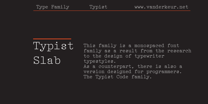 |
Arachnology Font Family was designed by Omar Sacca and published by Ortho. Arachnology contains 2 styles and family pack...